
Last week I wrote about the CMS site that shows what payments healthcare providers have received from companies (2013 through 2017). It was kind of eye-opening for a lot of us.
Then, one of our local EndoSisters asked if I could put it in a format to compare the local doctors here in California that many of us go to. Of course, I chomped at the bit for any excuse to make a spreadsheet…
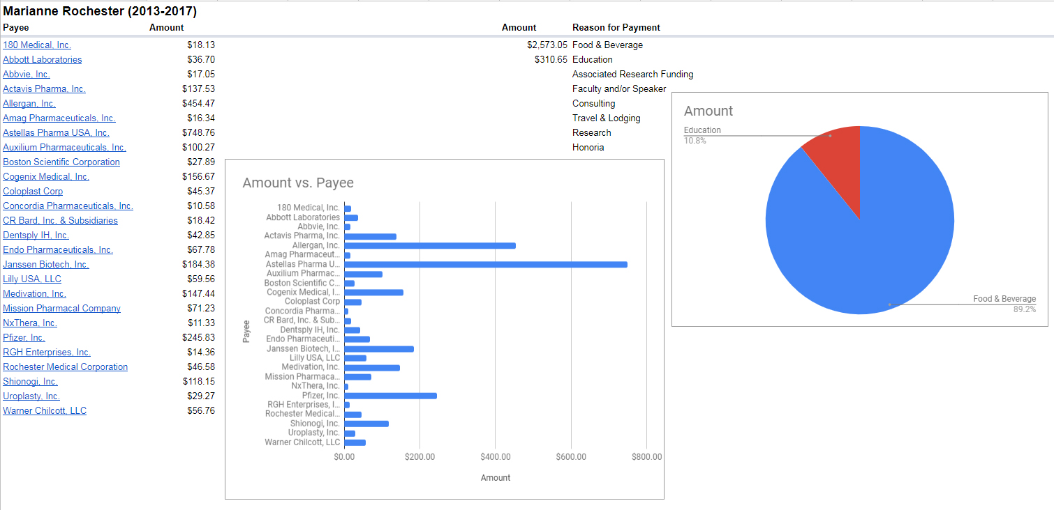
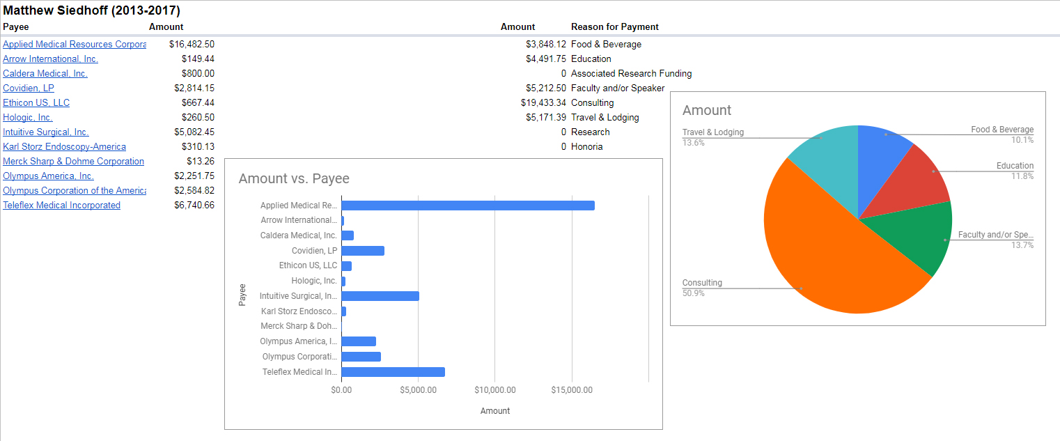
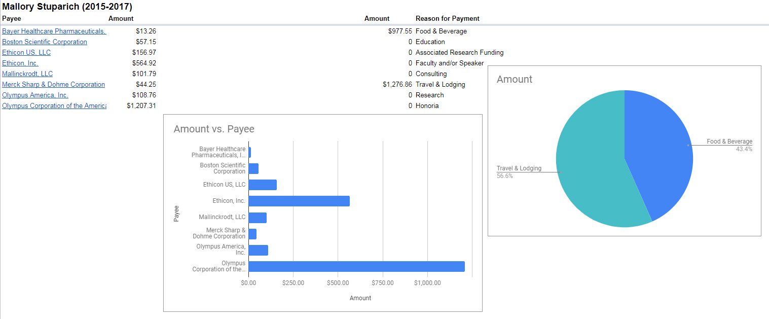
And it was even more eye-opening. I gathered the data from the CMS site, compiled it all into a visual format for each of the doctors that we’ve recommended (or not recommended) to each other in our private Bloomin’ Uterus support group. I’ve shared this data with my girls, but wanted to also share it with you guys. Not every one of our doctors showed up on the list (yay!).
I encourage you to look up your physician on the CMS OpenPaymentData site. Look at each year. Analyze the payments: was it for food, consultations, research, or education? Feel free to jot down notes and ask your physician what the payments were for. And decide if, based on their answers, you feel like continuing your care with them.
Why is this so important to me?
As a woman who suffers from Endometriosis, our prescription treatment options are limited and chock-full of side effects. Birth control pills, IUDs, Lupron Depot, Orilissa, Letrozole: medications that only mask symptoms and do nothing to stop the progression of the disease. And some of the physicians that we go to seem to have been paid a lot of money by pharmaceutical companies for consulting, research, and other fees.
…which leads me to think their treatment plans may be biased. But that’s just me being a conspiracy theorist and (without having spoken to these physicians) assumed it can be a sign of their integrity; or lack thereof.
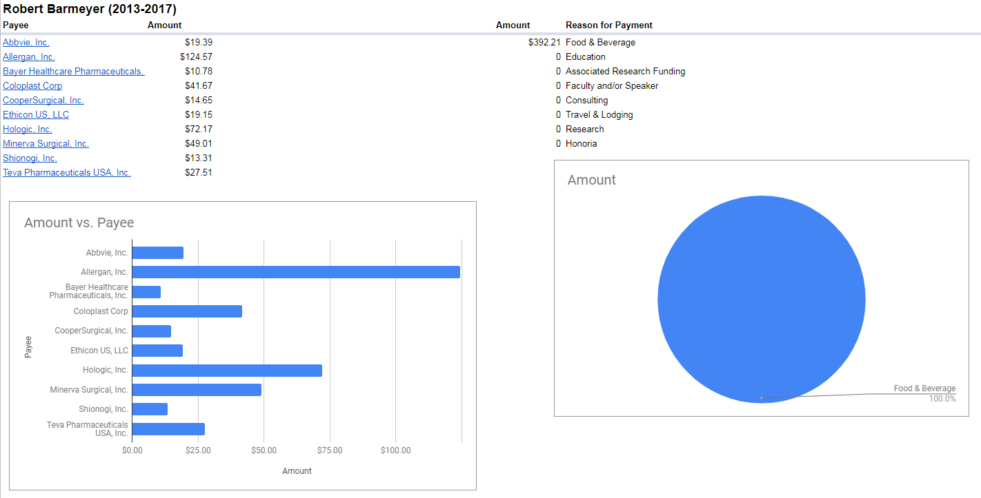
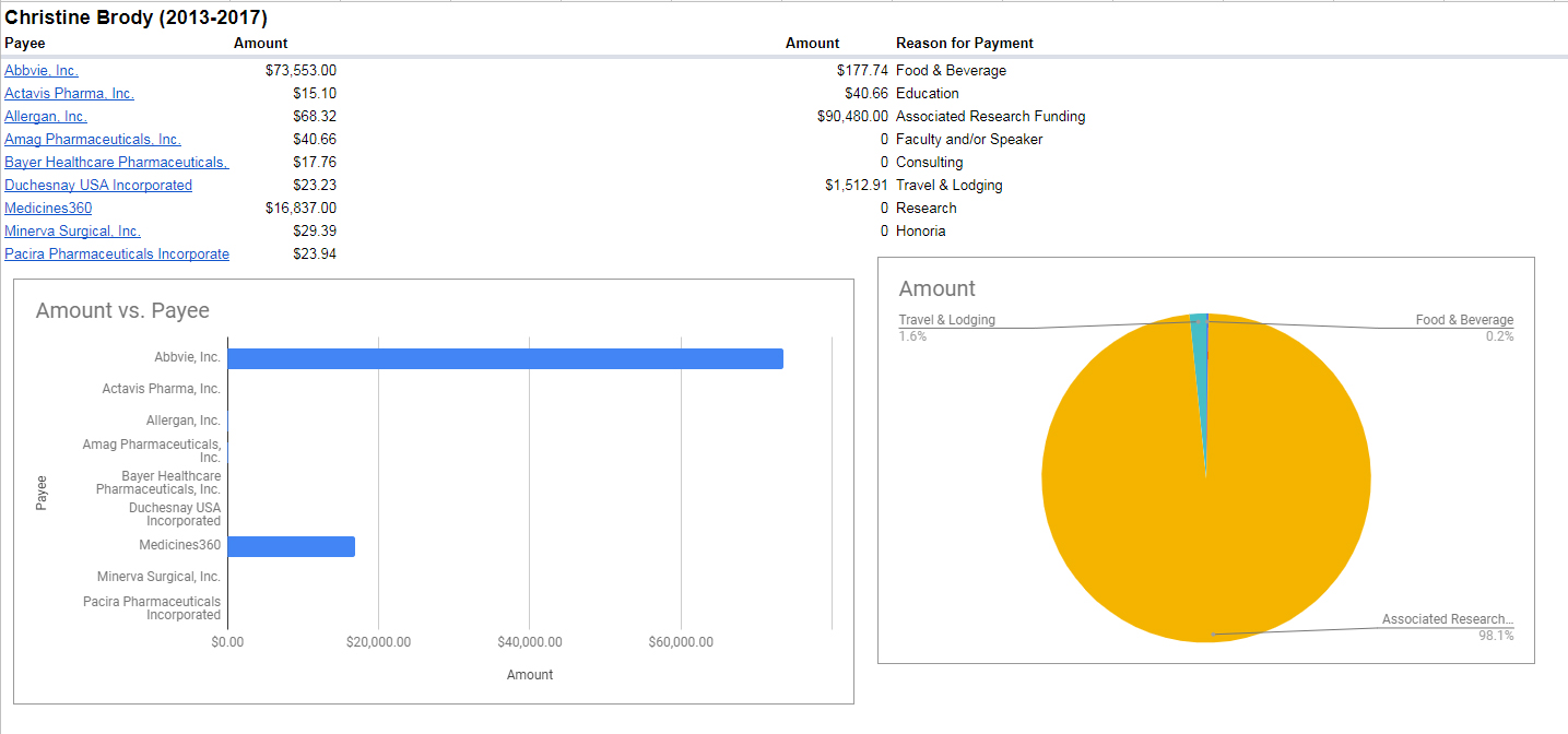
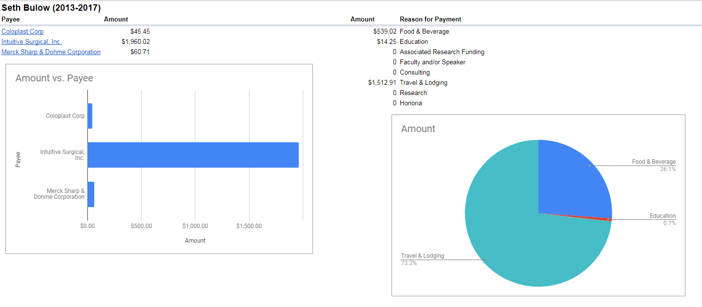
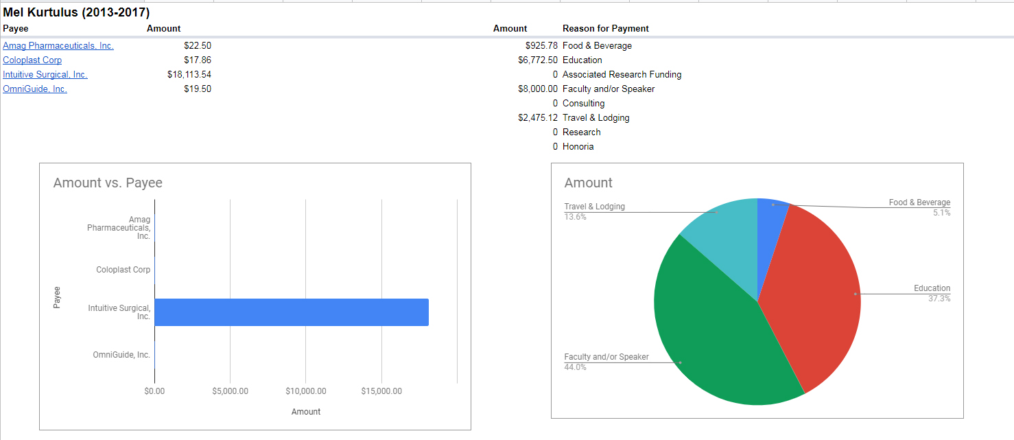
BUT I wanted to share the spreadsheet with YOU! Again, all of the data was taken from the Open Payments Data webpage. There’s a “Master” tab to view all of the entries of our physicians, then each doctor has their own individual tab so you can see the breakdown of payments from companies, as well as the percentage of what those payments went to (food, lodging, speaking, research, etc.). The “Payee” column has hyperlinks to the companies, so you can find out what they make (and figure out why they were reaching out to your healthcare provider). Many are pharmaceutical companies, but some are also medical device manufacturers, surgical equipment vendors, etc. And many of the payments to physicians are purely for food and beverage, but a few of the physicians have giant chunks of pay for research, funding, and consulting. I again encourage you to talk to your provider to find out what these payments may have been for…and if it influences their treatment of your symptoms.
And to those of you who don’t want to spend the time scrolling through a spreadsheet (especially if you’re on your smartphone), here’s the breakdowns of the doctors our Bloomin’ Uterus San Diego & SoCal girls have seen (and either recommended…or not recommended):